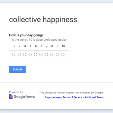
collective happiness
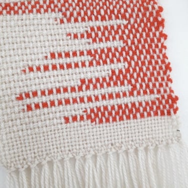
A fiber portrait of the community
Collective Happiness, 2015.
On a scale of 1-10, how was your day?
In this data visualization tapestry, each row shows the average of the collected responses from each day. All together, over time, we could see how we were doing. That first beautiful day of spring, that terrible national news day, just a regular Monday back to the grind, a holiday... what do they look like? what do they feel like?
Followers could see and watch the piece grow each day on the rigid heddle loom.